Login

Leaders in ESG data visualization: Federated Hermes

Next in our ongoing series on ESG leaders, we profile Federated Hermes and in particular their 2020 responsibility report. One of the more established names in sustainable investing, Federated Hermes have a long tradition of engagement and SRI, so we were interested to see what other managers could learn from their client communications.

Look and feel

The initial reaction when viewing Federated Hermes’ report is how well its elements coincide with the manager’s main digital presence – in particular their recently launched sustainability hub.

These cues help users gain familiarity with a brand and overall experience. This helps them absorb information, so the importance of consistency cannot be over-estimated.

From the start, strong use of tastefully cropped ecological imagery helps reinforce the environmental messaging. This is also in line with the firm’s brand – see section on brand hints below.

Federated Hermes scatters images throughout and mixes them with illustrated content, which is again consistent with their digital sustainability hub. 

Federated Hermes ESG Responsibility Report 2020
Leaders in ESG data visualization: Federated Hermes 1
Leaders in ESG data visualization: Federated Hermes 2

More on imagery

Timelines are nothing new, but this one is simply executed and does not over complicate the message or crowd the space available.

Here, Federated Hermes uses it well to remind us about their commitment to responsible investing.

The date shapes feel like leaves or droplets, which keep the ecological theme and reflect part of the Federated Hermes logo. This is a subtle touch that is reflected throughout the report – see Brand hints section of this report.

Illustrations

As mentioned, the report draws many similarities to Federated Hermes’ sustainability hub, not least in its use of illustrations over more traditional photography.

The illustrations are not just to make it look different. They are clever in that they tell a story, for example, of the boardroom being connected to the environment, with grass and plants underneath the boardroom table.

The boardroom executives also demonstrate diversity in action with a strong mix of ethnicity and gender.

Subtle execution but a strong message that environmental, social and governance (ESG) principles and inclusion are built into the culture of the business.

Leaders in ESG data visualization: Federated Hermes 3
Leaders in ESG data visualization: Federated Hermes 4
Leaders in ESG data visualization: Federated Hermes 5

Brand Hints

The brand hints are integrated nicely in this report, with subtle references to the logo throughout. This creates a special feel and shows the firm has thought through its designs carefully.

To save time and money, in the short term, they could easily have cut corners on this. But these brand hints show a commitment to the details, which will help build trust with customers and other readers of the report.

Leaders in ESG data visualization: Federated Hermes 6

Text clarity

Clarity of communication is critical when communicating or visualizing data, especially where the report is a little text heavy.

Choice of font is key, and size and weight can be added to emphasize key areas. Federated Hermes does this to great effect here with key stats drawing your eye.

This helps the impact of the sentiment hit home in a simple and bold message.

Leaders in ESG data visualization: Federated Hermes 7
Leaders in ESG data visualization: Federated Hermes 8
Leaders in ESG data visualization: Federated Hermes 9
Leaders in ESG data visualization: Federated Hermes 10
Leaders in ESG data visualization: Federated Hermes 11
Leaders in ESG data visualization: Federated Hermes 12

Circular graphics

Sustainability is represented through circular graphics in several places throughout the report. Icons also feature in the text to help highlight which part of the sustainability story is being represented and simplify the message.

The report uses simple, bold colors to provide strong differentiation, and icons to support text and reaffirm its meaning.

Circles can be used to represent sustainability, ecology and nature because of their soft organic shape. Federated Hermes’ team capitalizes on this principle here.

Consistent use of icons and colors helps with clarity and cohesion in the data storytelling across all types of graph here. This typifies the attention to detail that runs throughout the report.

Leaders in ESG data visualization: Federated Hermes 13
Leaders in ESG data visualization: Federated Hermes 14

Bar charts

It’s not all creative applications of circular charts. Federated Hermes uses bar charts to compare their performance against benchmark data.

Often, simple messages can be lost when design teams try to be over creative in the visualization. But not here.

The manager uses simple comparison bar charts throughout. The team stick to a limited brand colour palette to bring extra clarity to the data and emphasize the comparisons.

Leaders in ESG data visualization: Federated Hermes 15
Leaders in ESG data visualization: Federated Hermes 16

Connecting taxonomies

As part of the Federated Hermes SDG taxonomy you can see here the use of a very interesting linear timeline style matrix. This clearly demonstrates how it can be used to identify the connections between the SDG (Sustainable Development Goal) and investment opportunities.

This is interesting and extremely valuable because it helps explain the story of the data as well as the process for determining impacts.

Spotlight and pull quotes

To focus the user’s attention on text heavy sections, Federated Hermes have created spotlight boxes to draw the eye.

They use these sparingly and effectively, similar to the way they do it on their websites.

The team designs its pull quotes very creatively, with an aged paper effect and torn edges, almost like a treasure map.

It adds focus without feeling repetitive or antiquated.

Leaders in ESG data visualization: Federated Hermes 17
Leaders in ESG data visualization: Federated Hermes 18

Summary: we love this consistency and value

In our recent review of the 25 best asset management websites, we saw some fantastic examples of asset managers embracing creativity and keeping up with modern design practices.

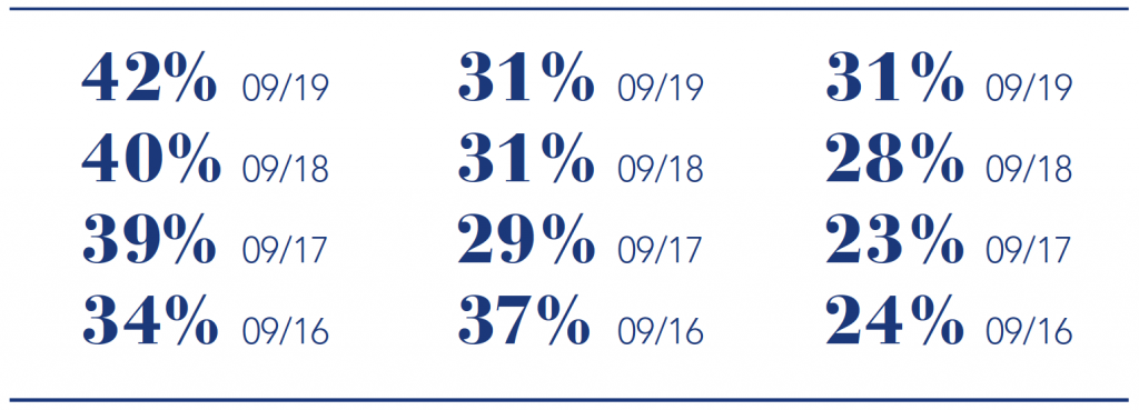
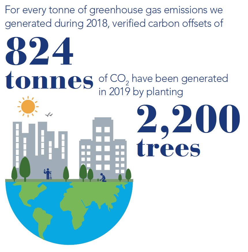
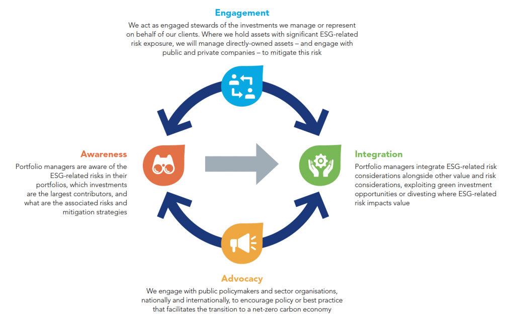
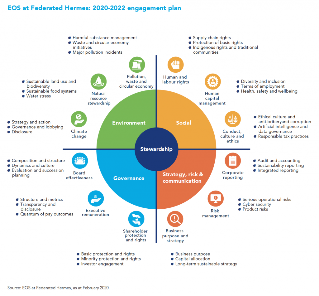
It is encouraging to see how organizations like Federated Hermes are carrying these principles into data visualization for ESG reporting. Here, the bridges between the report and the firm’s new Sustainability hub portal add consistency and value to the experience and we absolutely love it. As with the other leaders in ESG data visualization, this approach is changing the game in the industry, to the great benefit of customer experiences.

At Kurtosys, we are proud of our fast, scalable and easy to use technology. We also love solving data visualization problems with creativity. Are you struggling to keep up with changing trends in data visualization for ESG reporting? Do you need to automate difficult and costly processes, deliver critical data at pace, or update your user interfaces and website design? If so, get in touch today.

Talk to our team and arrange a demonstration of how our tools can add value to your digital transformation.

Facebook
X
LinkedIn