Login

5 Ways to improve the UX across your Asset Management website without a designer

When building your asset management website, user experience (UX) is everything. But not everyone has dedicated design / UX resources to help maintain this. Here is our 5 tips for improving your user journeys and achieving a good level of basic UX without a designer.

🎨 Use a consistent color for primary calls to action

Go through your most important pages, such as for funds and priority campaigns, and ensure all buttons and links are the same color. If you do not have an agreed color for buttons and calls to action (CTAs), research colors and choose one of the most popular from your brand palette.

5 Ways to improve the UX across your Asset Management website without a designer 1

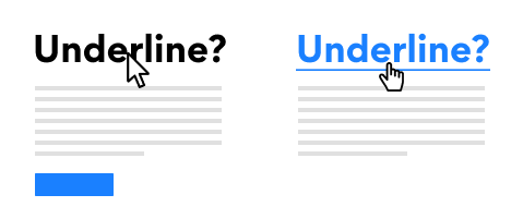
🌏 Shorten your customer journey – reduce navigation to your most important pages

Identify your four or five most important pages – for asset managers, these tend to be your priority funds, insights and sustainability pages. Count how many clicks do customers have to make to get to these pages. Can you reduce the number of pages a user has to navigate to get to these key pages? For example, if the user has to visit landing pages to get to your key pages, link them straight from the homepage instead.

*Feature Ad: Offering the ability to reduce time to these on return visits with notifications, sign-up on new documents or insights is a great way to reduce friction with users accessing your content.

5 Ways to improve the UX across your Asset Management website without a designer 2

✂️ Shorten copy to be simple and easy to skim read

Ever heard of TLDR (Too Long, Didn’t Read)? This applies to web page content now more than ever. Lots of detail, data and deep insights have a place in whitepapers and downloadable content, but not on your main site copy or fund landing pages. Bring the key information to the front and allow users to choose when they want more information.

5 Ways to improve the UX across your Asset Management website without a designer 3

📝 Use underlines for links, and de-clutter the rest

Using underlined text for links allows users to recognize it, which reduces the burden on them. It makes the copy on your webpage easier to browse and navigate. Avoid different colors for links and underlining for emphasis, as this will have the opposite effect.

5 Ways to improve the UX across your Asset Management website without a designer 4

📢 Prioritize clear, bold headlines that guide browsing

Make all your headlines easily digestible. Visibly they should be bold and possibly have increased spacing. They should also have engaging, concise content that leads into the copy below. Doing this ensures users do not have to scan headlines and read the copy before they know whether they are in the right place.

5 Ways to improve the UX across your Asset Management website without a designer 5
Thanks to Dan Gough from HeyHiHello for the original inspiration.

For more inspiration and tips on web design for asset management, please download our white paper

Facebook
X
LinkedIn