In recent years, the concept of inclusivity and the need for broader accessibility and usability of digital materials is coming sharply into focus. It’s heartening to see a growing desire to break down barriers for those who are excluded from the workspace, not due to talent but because of a lack of tools available or supplied.
With this in mind, companies are creating more diverse and accessible workspaces. They’re also starting to develop more inclusive programs and accessible applications to fill the needs of users that do not fit a stereotypical mold. Companies’ internal rules and regulations take this into account when hiring staff, and various countries are applying this to their regulatory structure for businesses.
Accessibility is a very important factor to consider early on when developing new features and functionality. We consider the needs of users with visual, audio, and mechanical challenges. Items like screen readers, keyboards or any other form of assistance are more and more commonly used, and we can now include UI elements and content that can be retrieved and played back by these supportive devices. Many of our existing features have been updated to allow for broader accessibility.

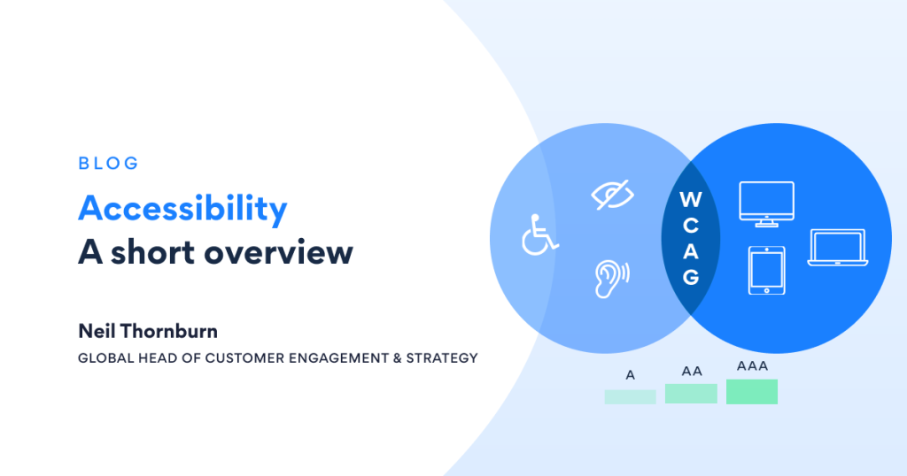
The transformation from inaccessible to accessible is not a trivial one. Multiple development and design teams are collaborating to adapt colour palettes and fonts. Then there are the more advanced changes that include keyboard traps, non-content text and reflow solutions. The Web Content Accessibility Guidelines (WCAG) are comprehensive and seemingly infinite. There are different levels of conformance to be met, depending on the WCAG level considered appropriate. Our final goal is the highest possible level of WCAG, with modifications added incrementally.
Looking at Kurtosys Studio, the requirement to modify one of the most frequently used apps became evident – The line chart app. Line charts are easily comprehendible charts. Lines indicate a rise or fall in whatever is being displayed. Axes clearly display what is being measured and in what increments over a period of time or other measurement. And when viewed on a website, hovering a mouse of a point on the line displays a pop up with additional detailed information.
But, what about the visually impaired person? They can’t necessarily see points on an axis. They may not have sufficient vision to see the line itself or that the lines displayed are in different colours. Our team’s goal was therefore to make a line chart “readable” by someone visually impaired, in line with WCAG rules.
A line chart presented as an image with alternate text is not accessible and cannot sufficiently cover the intricacies of a chart. Enhancements for accessibility therefore include repositioning the tooltip outside the content area of the x and y axes of the line chart so as not to obstruct the view of the line chart.
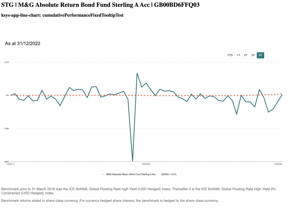
The ability to configure the style of the line strokes (e.g., dashed lines compared to solid lines) was added. Different line types make it easy for a colourblind user to differentiate between the lines. All breakpoints and zoom levels need to be catered for without causing obstructions or distortions.
For a user with complete impairment, screen reader accessibility is key. When accessing the chart, the screen reader will need to announce start and end values for the available lines as well as read points on the lines as needed.
Additionally, recommendations have been made to developers to include a table below the chart indicating a subset of periods across the line chart e.g., 1 month, 2 months, etc. with corresponding information.
The line chart is one of many items in our set of available features where accessibility is a factor. We are working our way through the Studio Apps and other items such as the bar chart have already been amended. Ensuring accessibility for all users with diverse needs is crucial, and we are proud to have made significant strides in making Kurtosys products accessible to users with a wide range of disabilities. From common to rare, we are on a journey to implement the necessary changes to ensure inclusivity for all, taking WCAG as our guide.
If you’d like to make the transformation towards accessibility in your organisation, get in touch with us today. Or feel free to request a demonstration of how our tools and services can add value to your digital transformation.

